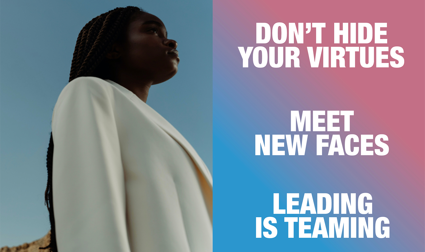
LEADERSHIP IN TRANSFORMATION PROGRAM
THE SOLUTION
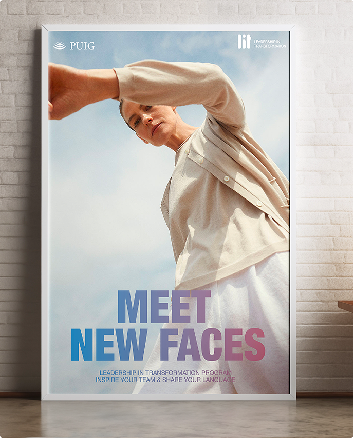
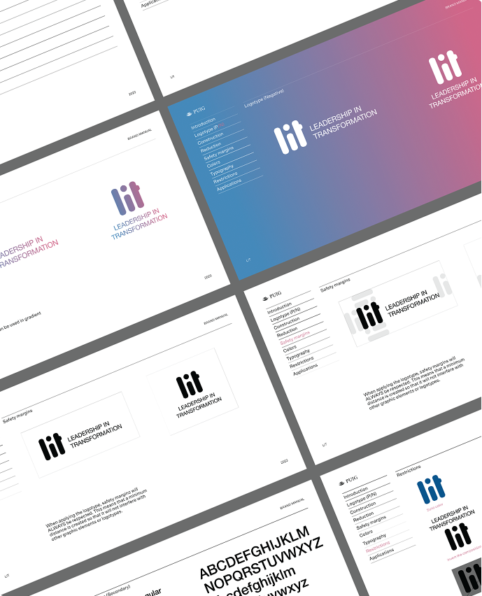
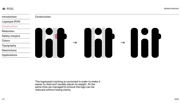
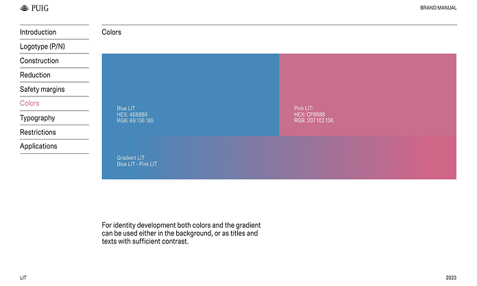
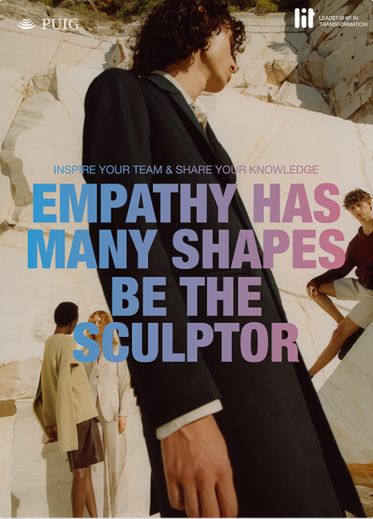
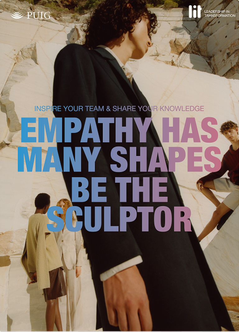
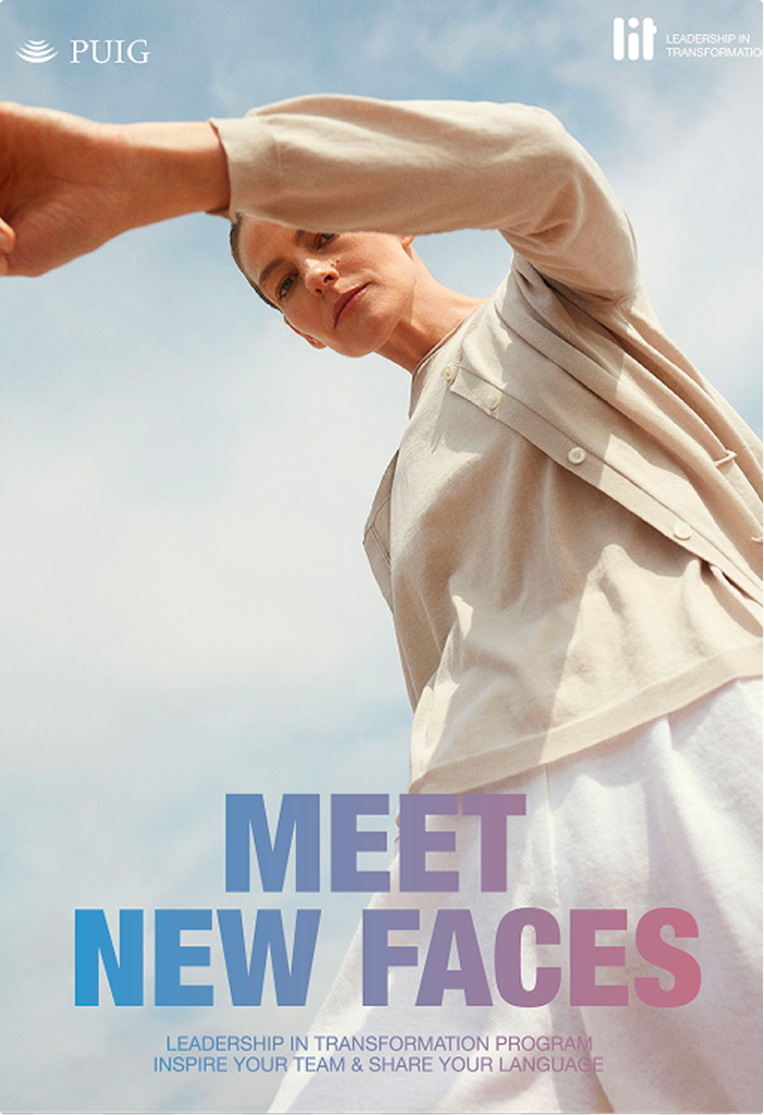
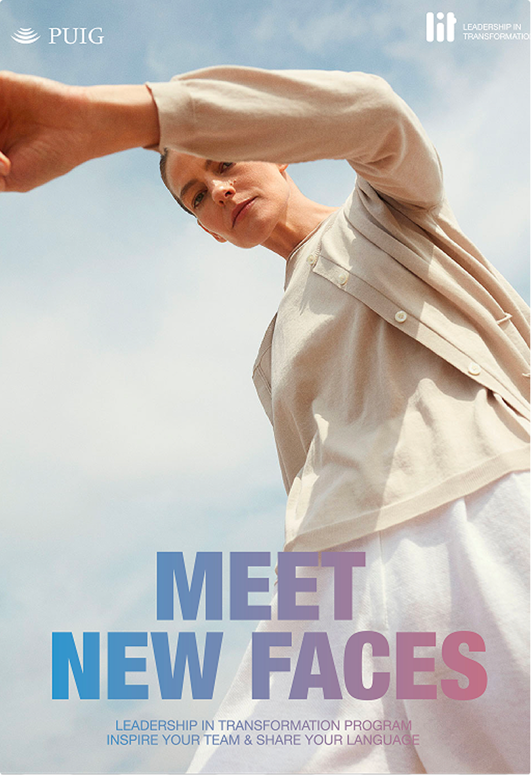
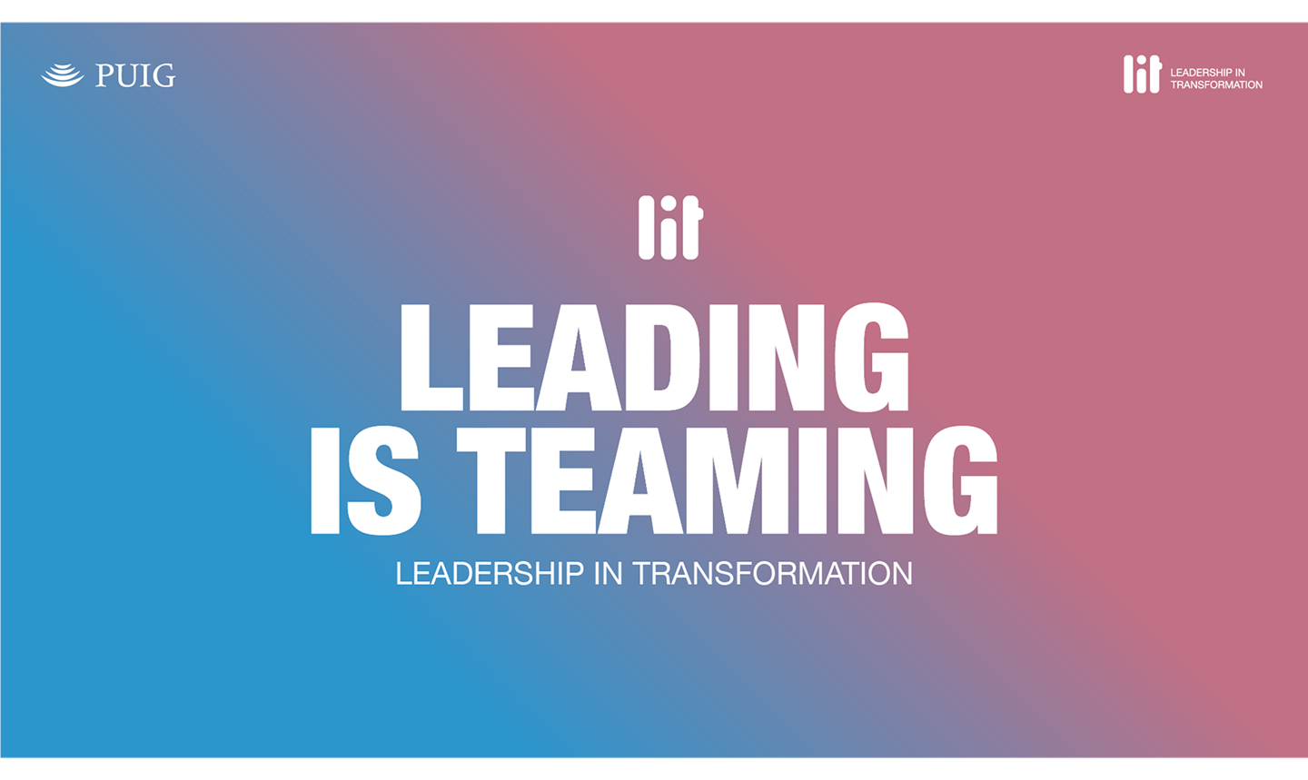
We developed the LIT naming, rich in meaning (light, ignition, inspiration), and built a visual system that embodies what it promises: leadership that cares. The gradients create a sense of closeness, the organic forms work as three figures in constant dialogue, representing diversity, while the rounded endings convey the calm and emotional stability that the programme seeks to foster. The identity was rolled out across every programme touchpoint: training materials, digital platform, internal communications and events.