GADES & STACKHOUSE

THE SOLUTION
A new name: Gades & Stackhouse. Two surnames that evoke craft, lineage and a handwritten signature.
A real estate atelier.
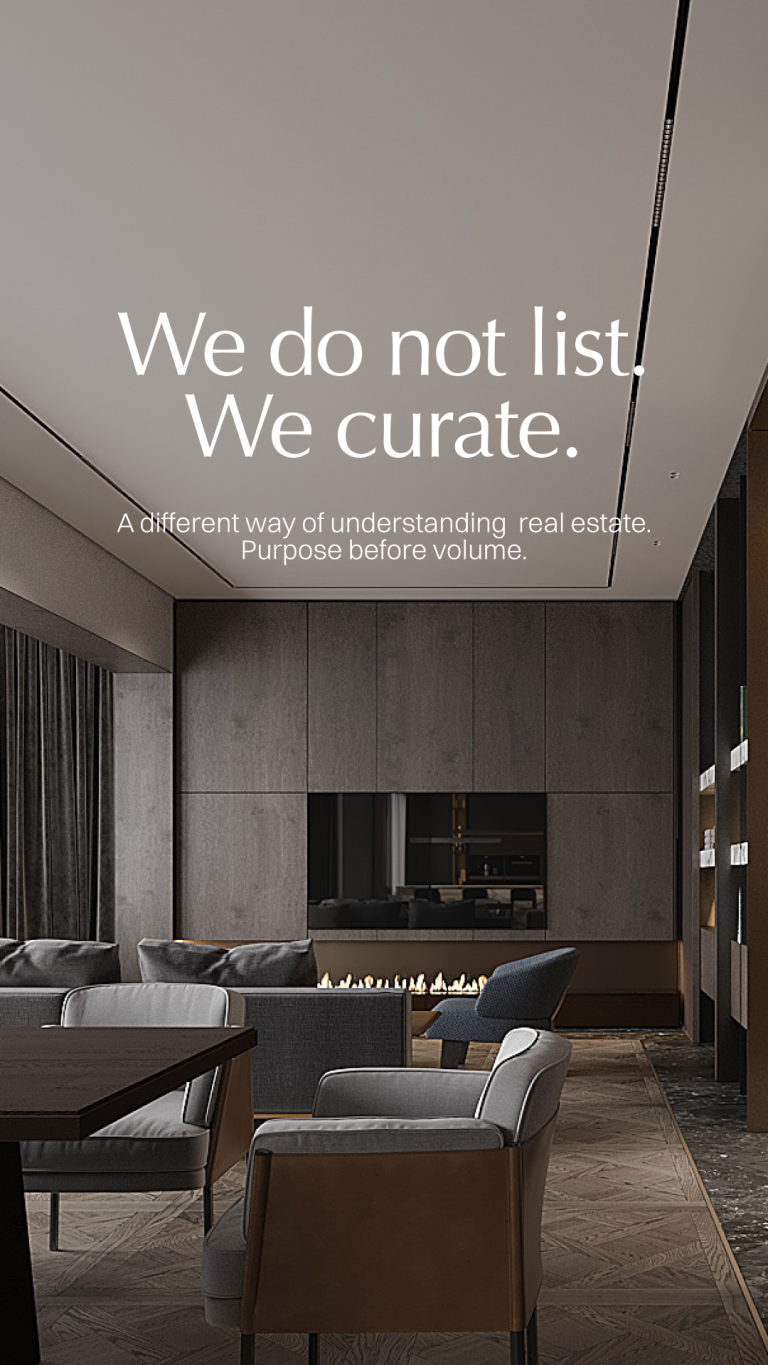
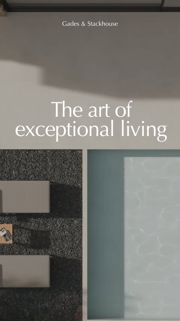
A tagline that closes the universe: El arte de habitar lo excepcional / The art of exceptional living.
The manifesto defines the category:
“We work in silence. We know the movements before they happen.
Our portfolio is not published; it is curated.”
An invitation into a circle, not a transaction.
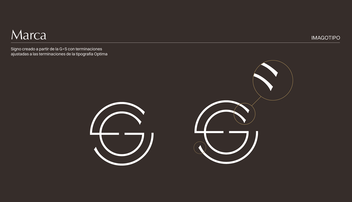
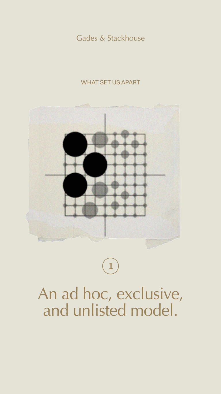
The visual system was built like a piece of jewellery. A circular seal with the G+S monogram, inspired by the marks of great families, wax seals and the heraldry of a craft well done. A symbol designed to age with prestige, not to attract attention.
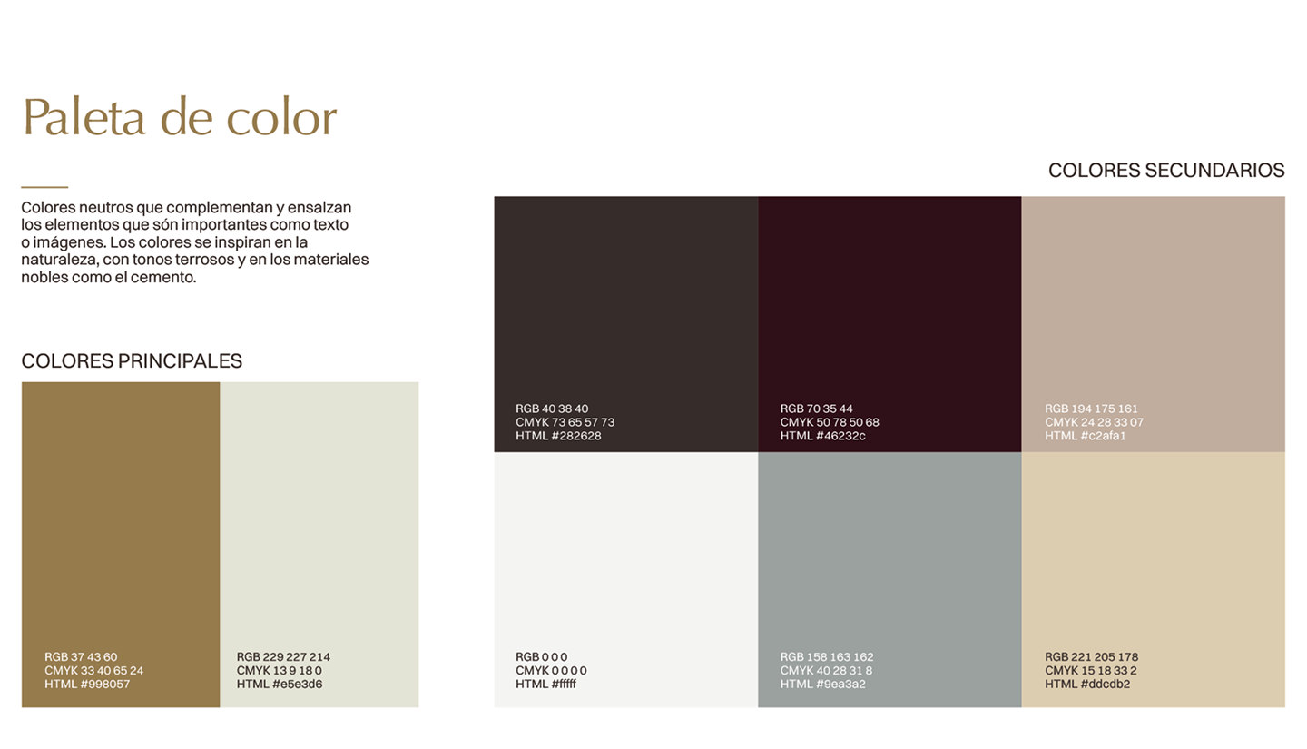
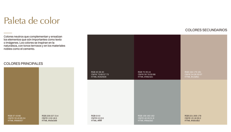
The Arizona Flare typeface balances classicism and modernity with a touch of Mediterranean refinement. The palette is sober, restrained, made of stone, linen, shadow and light.
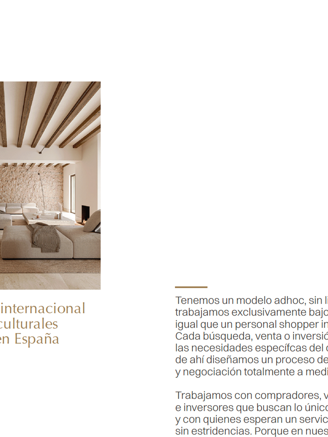
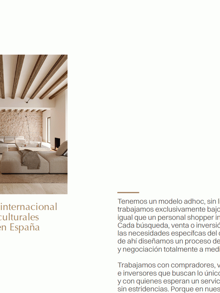
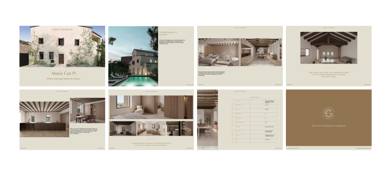
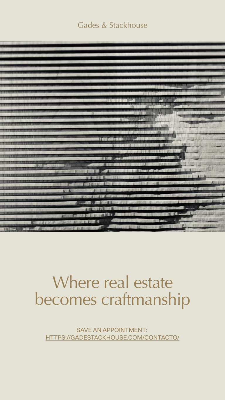
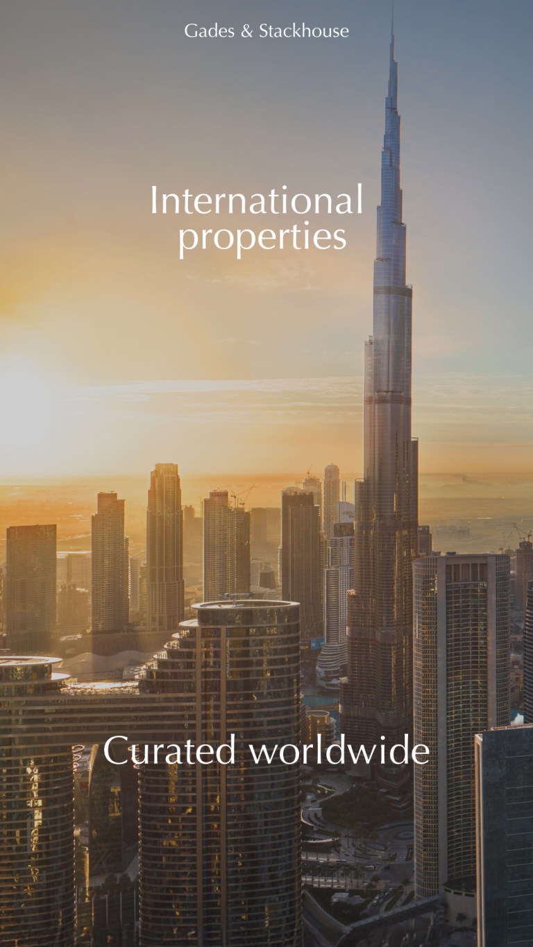
The photography combines proprietary architecture with editorial curation: images that do not show properties, but atmospheres.
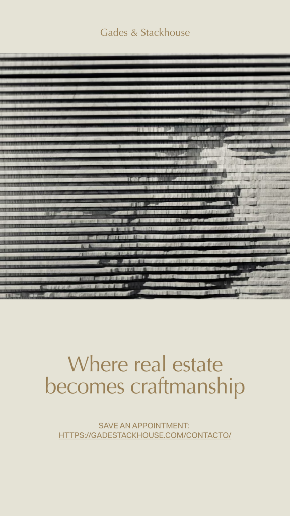
Every piece —website, identity, narrative, social media— breathes the same aspirational silence: that which does not shine, but stays with you.